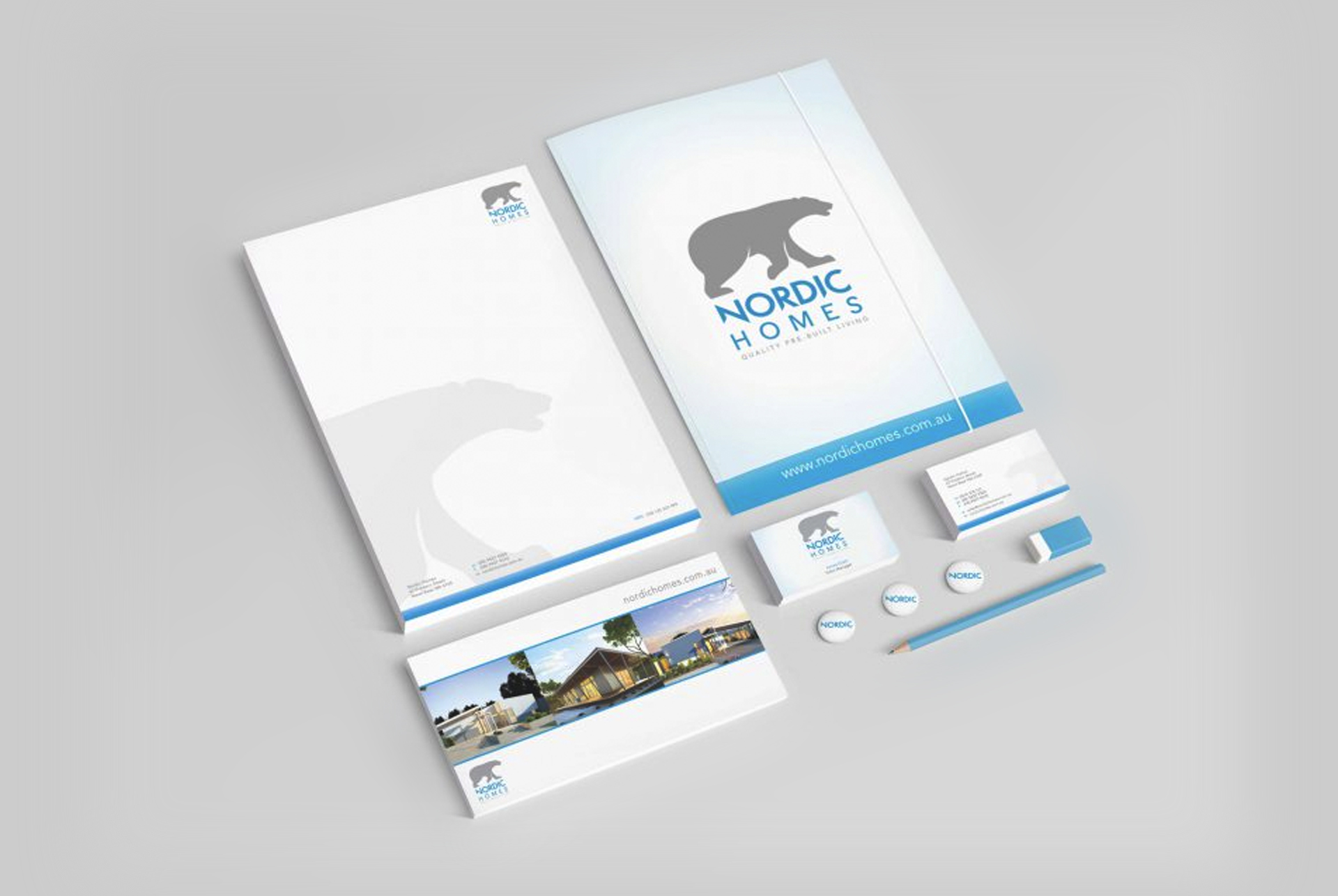
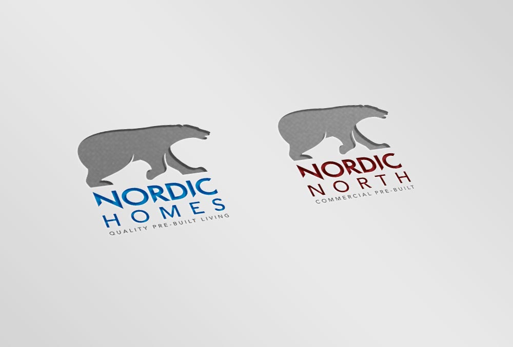
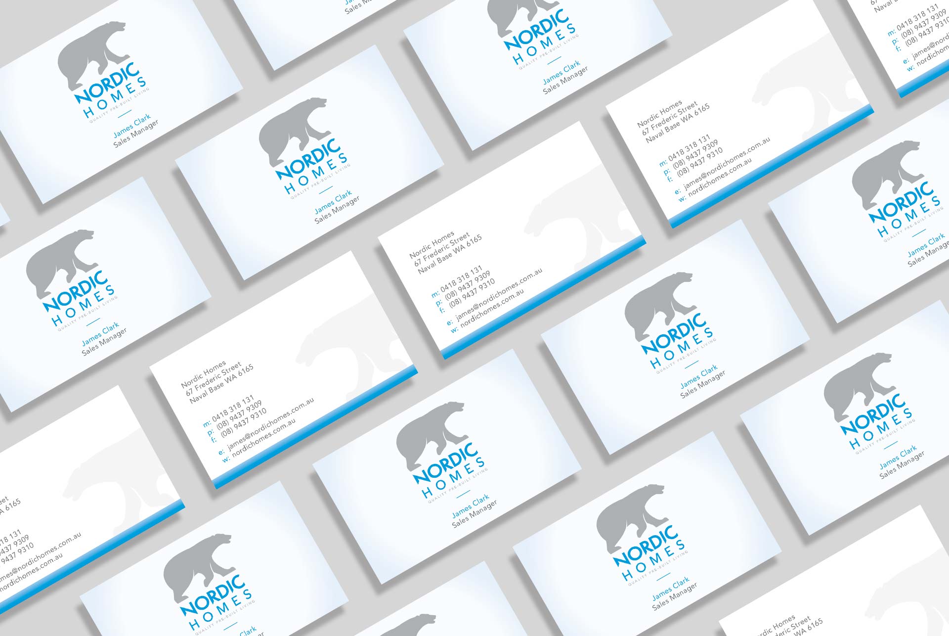
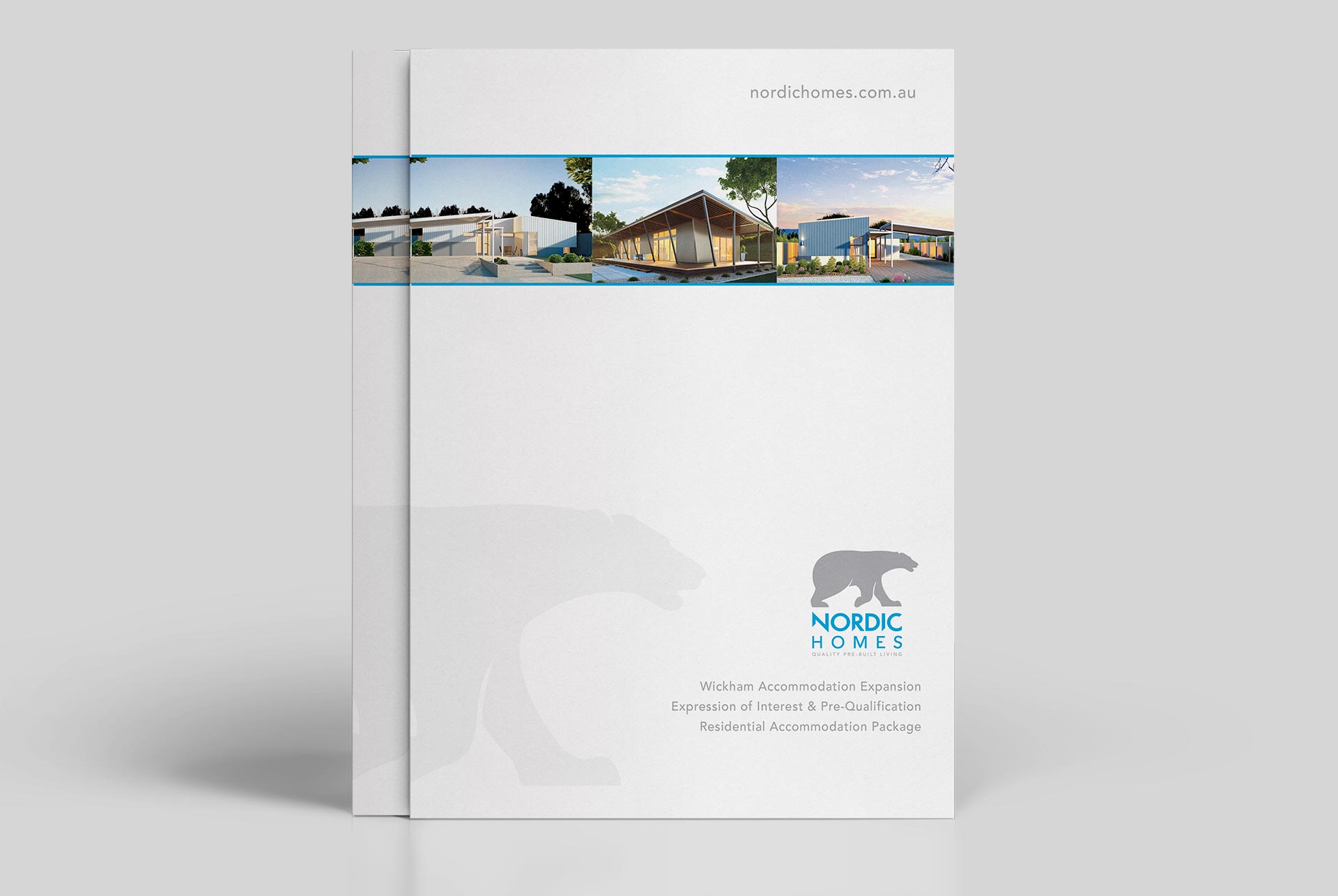
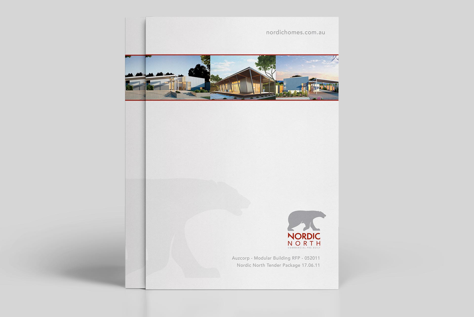
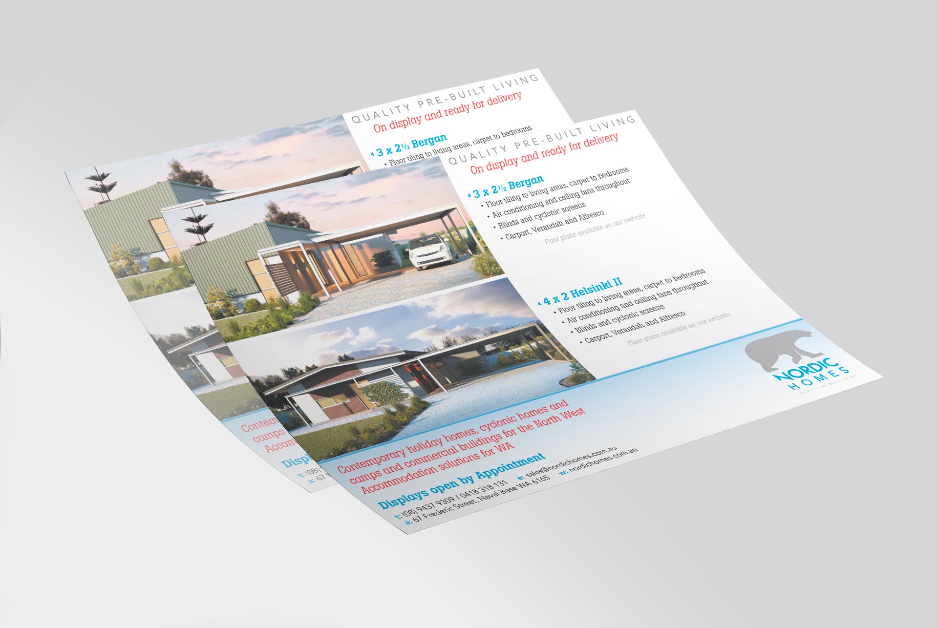
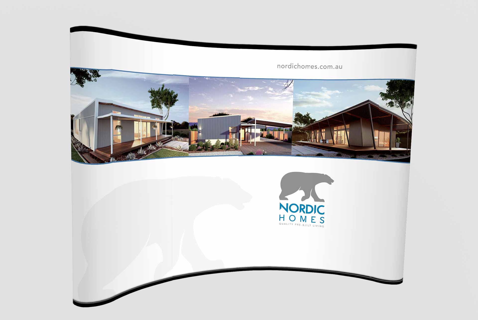
This was an unusual project for us. At ADS we're used to the scorching hot midday sun and lathering on the factor 30+ as soon as we step outside the office. So when we were approached by Nordic Homes to redesign their brand identity, we jumped at the chance...especially when we were told they wanted to keep their theme of a polar bear! So we put our woolly thinking caps on, re-drew a slick new bear and applied it with sharp Scandinavian style typography and some icy blues to business cards and letterheads. The result; a fresh, crisp new look for this successful transportable homes company.